

Use T-score Maps to Interpret PROMIS Scores
What is a T-Score Map?
T-score Maps can be used to help interpret PROMIS® scores.
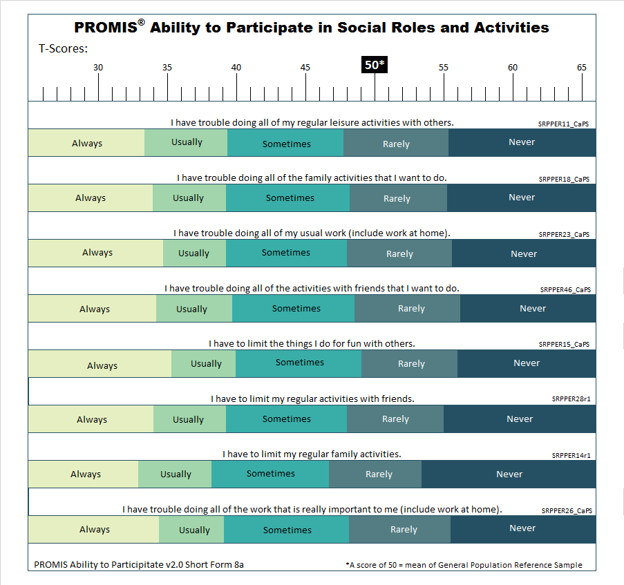
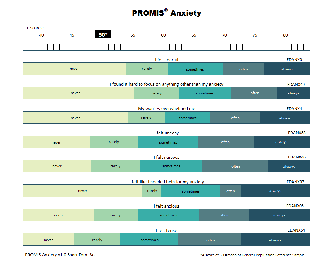
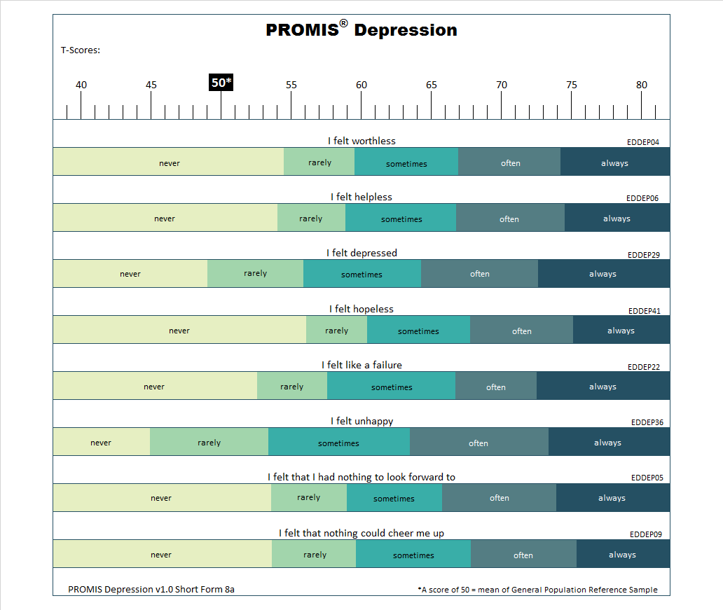
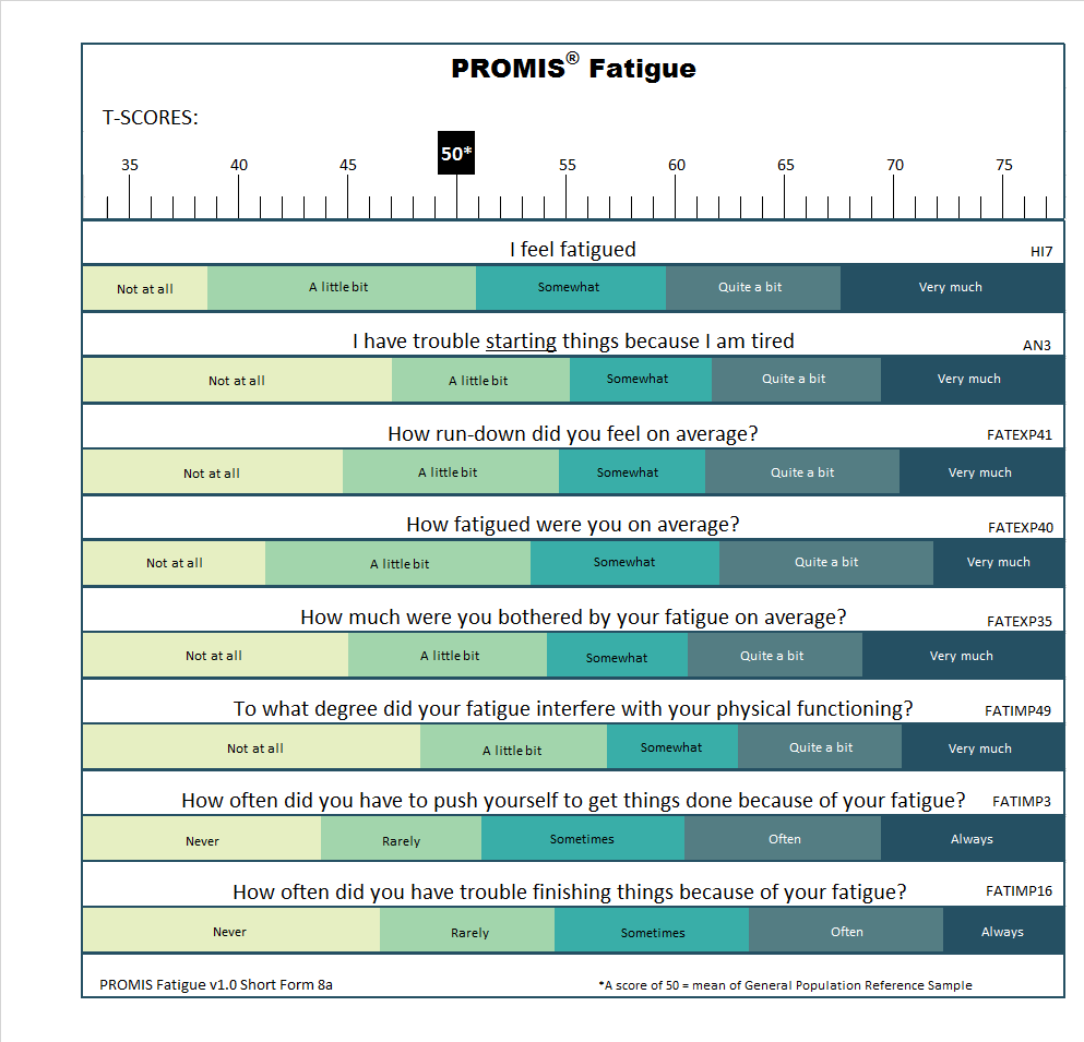
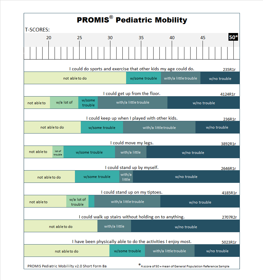
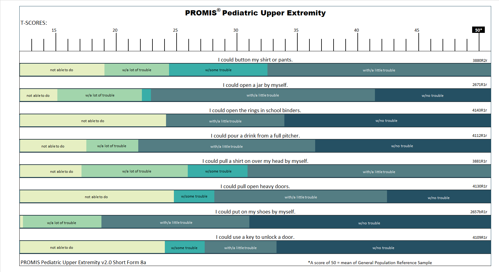
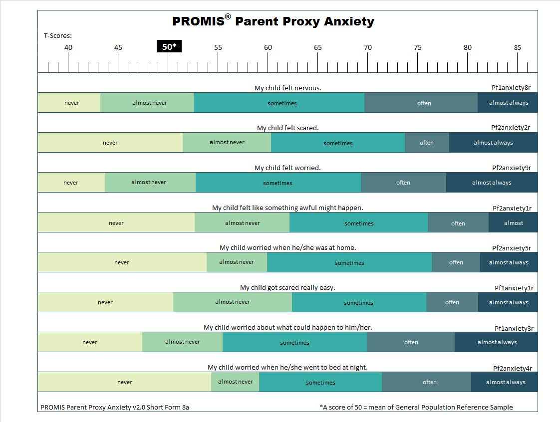
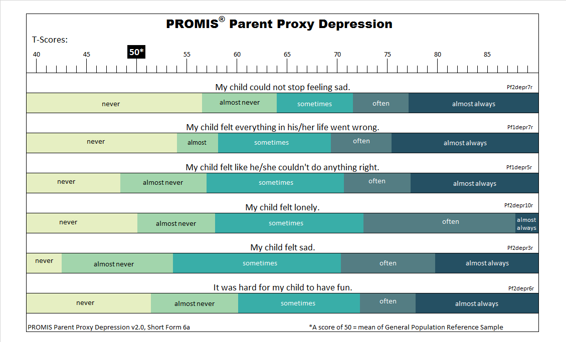
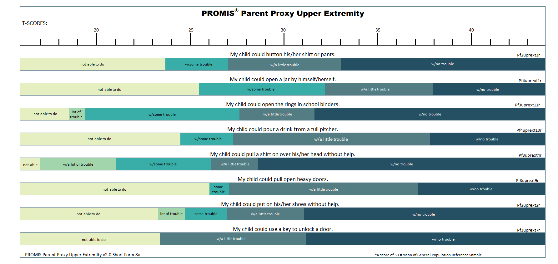
T-score Maps show the most likely response to a PROMIS item for every PROMIS score.

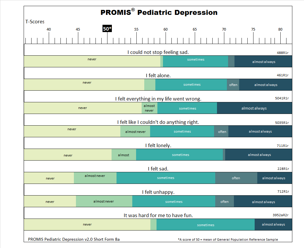
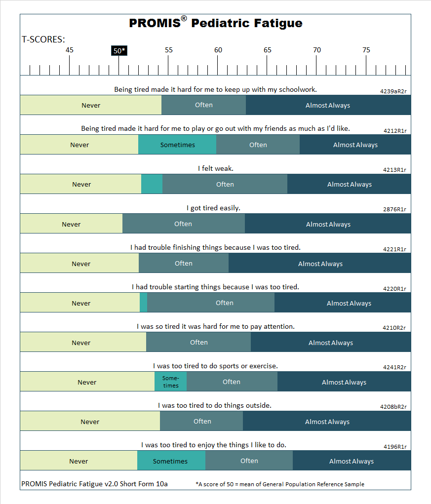
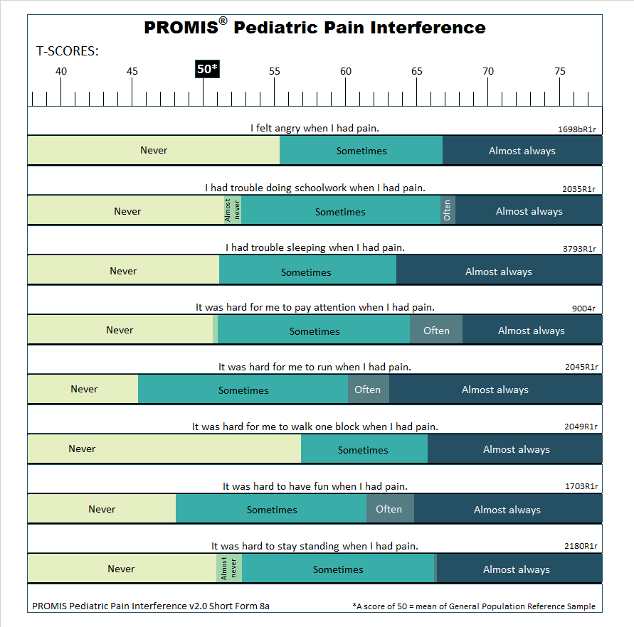
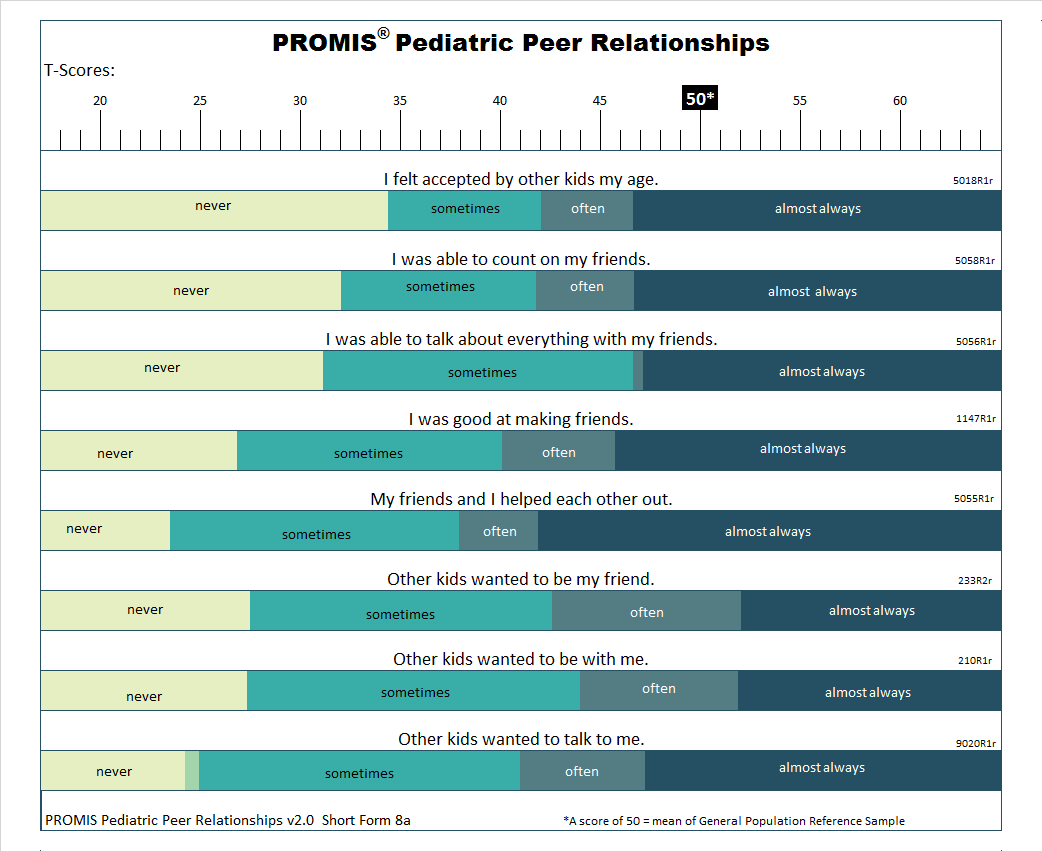
In the image above, each item in the PROMIS Short Form v1.0 – Depression 8a is displayed along with all response options. A T-score range for the measure is displayed at the top of the figure. To use the T-score Map, identify the score of interest at the top. Then, find the associated response for that score for each item. For example, persons with a T-score of 50 are most likely to respond “Never” to the item, “I felt worthless.” Persons with a T-score of 62 are most likely to respond “Sometimes.”
T-score Map Uses
T-score Maps help interpret PROMIS scores.
- T-score Maps can be used to train clinicians on how to interpret PROMIS scores. For example, a clinician understands varying levels of a symptom. Mild depression may be characterized by periodic feelings of sadness whereas severe depression includes persistent feelings of hopelessness and helplessness. This clinical understanding can be mapped onto responses on specific PROMIS Depression items, and those responses can be mapped onto PROMIS T-scores. Thus, a T-score Map is a bridge between the numbers of the T-score metric to the level of symptoms or functioning the T-score represents.
- Some clinicians have used T-score Maps to work with patients to set treatment goals. For example, a goal of reducing depressive symptoms by 5 points has no inherent meaning to patients. A T-score Map links that change to consequences that are relevant to patients. Instead of communicating to patients that the goal is to go from a PROMIS Depression score of 62 to 57, a clinician could explain the improvement as feeling helpless “Rarely” instead of “Sometimes”.
- A T-score Map can be used to help decide on an important threshold. For example, experts can review a T-score Map to identify the score that would indicate when additional follow-up or a referral is recommended.
Adult Short Forms (ages 18+)
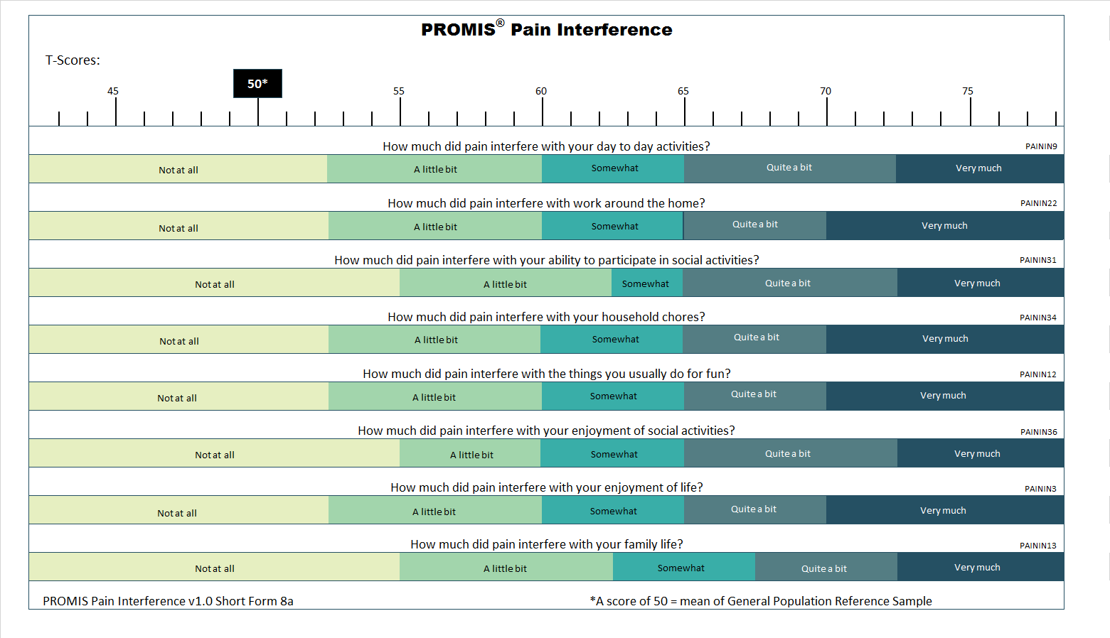
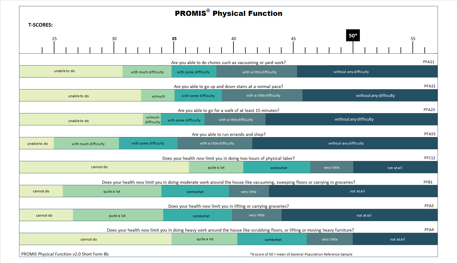
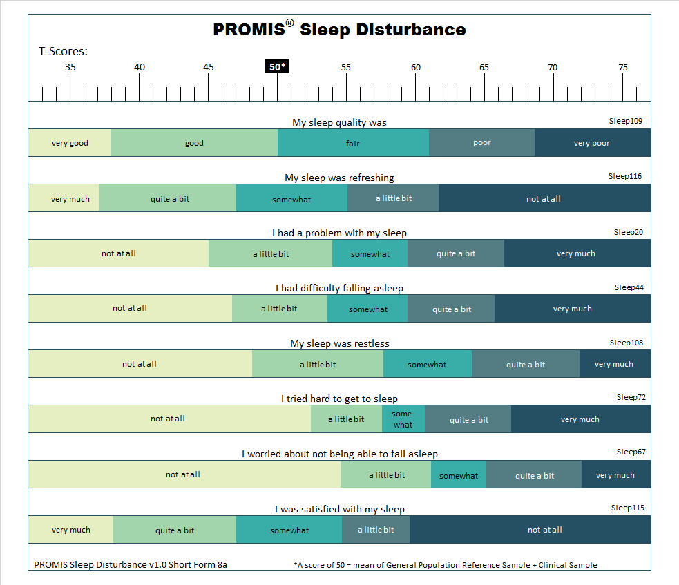
Below are T-score maps for selected short forms from PROMIS core domains.
Pediatric Short Forms (ages 8-17)
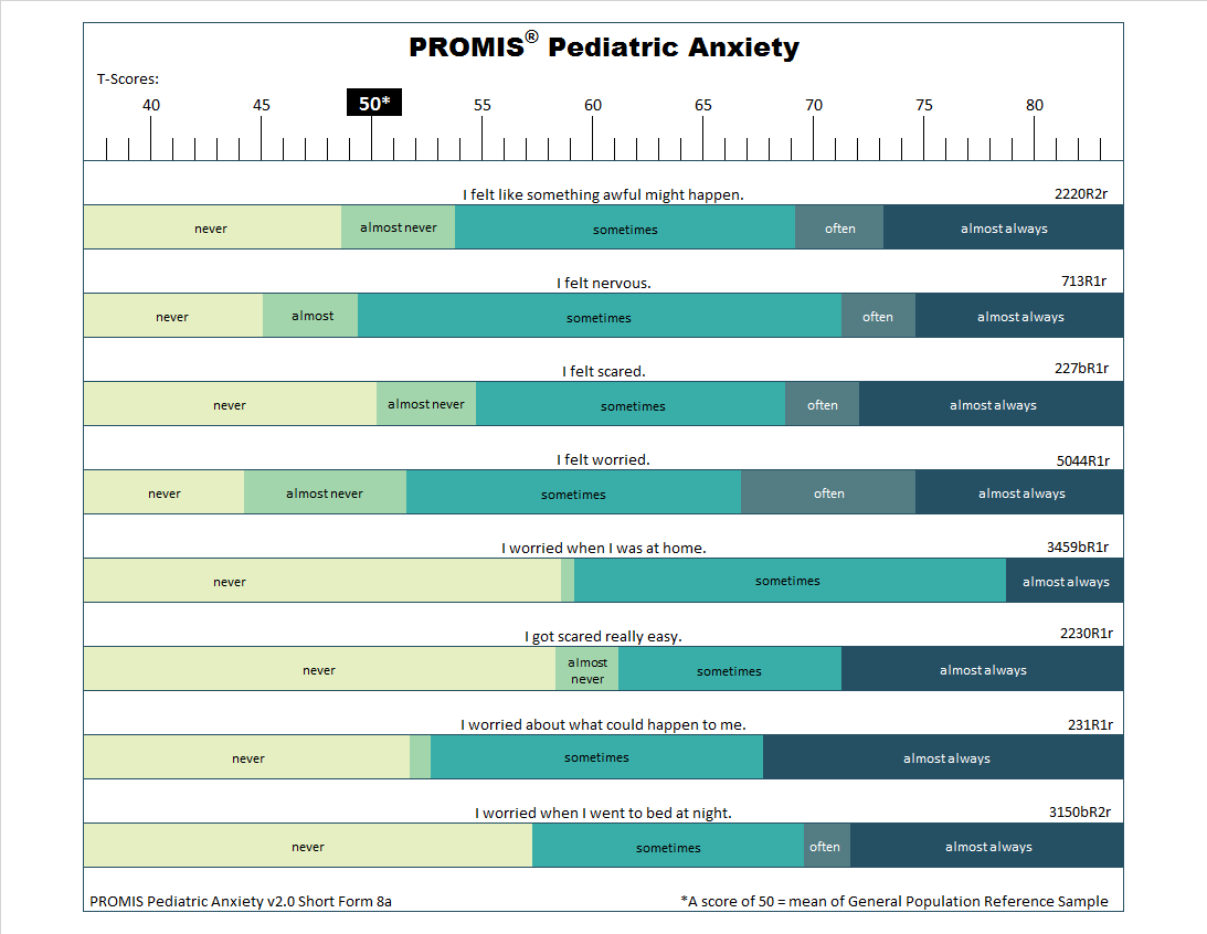
Below are T-score maps for selected short forms from PROMIS Pediatric core domains.
Parent Proxy Short Forms (ages 5-17)
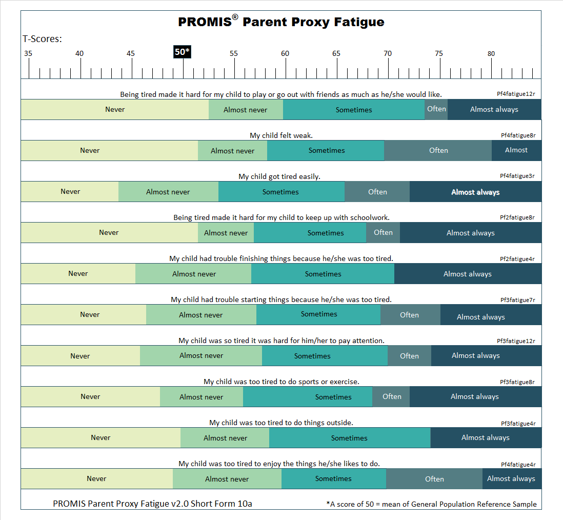
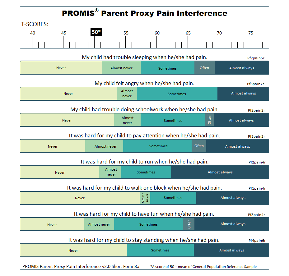
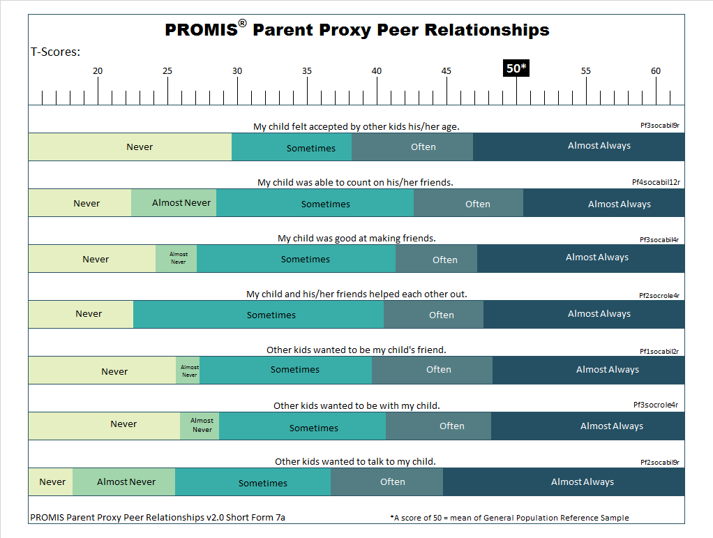
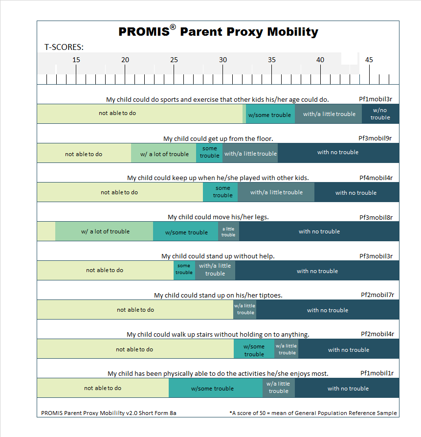
Below are T-score maps for selected short forms from PROMIS Parent Proxy core domains.
Methods
Item Response Theory (IRT) enabled the construction of the T-score Maps. IRT assumes that responses to a set of items or questions are related to an underlying “trait” (e.g., physical function). IRT models quantify how persons’ levels of a measured trait (e.g., high or low physical function) predict what responses they will give to an item (e.g., “With a little difficulty”). Therefore, to construct the T-score Maps, we wrote a software program that calculates the most probable response for every item at every T-score. The program utilizes the item-level parameters associated with each item. For each item, every response option had a range of T-scores where it was the most probable response. That range is represented graphically by the band labeled with that response. In some cases, a response option was never the most probable response and therefore is not shown for that item.
Note that not all T-score Maps will include the entire range of scores. Persons scoring below the lowest T-score are most likely to respond in the lowest category to all of the displayed items. Persons scoring above the highest T-score are most likely to respond in the highest response category to all of the displayed items.
More detail about the development and validation of T-score Maps is available in a 2020 publication:
Rothrock, N.E., Amtmann, D. & Cook, K.F. Development and validation of an interpretive guide for PROMIS scores. Journal of Patient Reported Outcomes 4, 16 (2020). https://doi.org/10.1186/s41687-020-0181-7
Frequently Asked Questions
Score cut points assign a descriptive label to a score range. They are focused on the overall measure score, not individual items. For example, PROMIS Depression is labeled “moderate” for scores ranging from 60 to 70. But what exactly do we mean by “moderate”?
You can use a T-score Map to give more detail on what “moderate” depression looks like in the real world. A T-score Map shows the most likely response to each short form item at each PROMIS score. For example, when I look in the 60 to 70 point range on the PROMIS Depression T-score Map, I see that the most likely response to the item “I felt worthless” is “sometimes” or “often”. As you read through the other items and most likely responses in this score range, it gives you a better sense of what moderate depression looks like.
We constructed T-score Maps for the short forms included in three PROMIS Profile measures (adult, pediatric, parent proxy). These are the most commonly used domains. While we would have liked to create T-score Maps for all short forms, resource limitations led us to focus on this subset to ensure quality and usability.
Last updated: September 30, 2026